Obi 504 Report post Posted July 7, 2017 La primul avatar textul este pozitionat prea jos...se vede cum iese din avatar. La a doua poza textul secundar trebuia mai mic, in rest ar c-am trebui sa mai lucrezi la blur si poate adaugi si niste gradient pe poza Oricum Bravo Ai Evoluat Frumos Share this post Link to post Share on other sites Awards
knz $ 306 Report post Posted July 7, 2017 Multumesc Obito!...Multumirile mele lui # SkyzzO kenz Share this post Link to post Share on other sites Awards
Kamerunezeu 554 Report post Posted July 7, 2017 1 minute ago, KeNzOr # EliteRoyal said: Multumesc Obito!...Multumirile mele lui # SkyzzO N-ai pentru e fra sti bine ca te ajut ! Share this post Link to post Share on other sites
knz $ 306 Report post Posted July 24, 2017 kenz Share this post Link to post Share on other sites Awards
knz $ 306 Report post Posted July 24, 2017 kenz Share this post Link to post Share on other sites Awards
Ràgñàr™ 736 Report post Posted July 24, 2017 ragnar ? Share this post Link to post Share on other sites
knz $ 306 Report post Posted August 20, 2017 kenz Share this post Link to post Share on other sites Awards
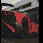
Traficant de Patrunjell 95 Report post Posted August 20, 2017 fain... Share this post Link to post Share on other sites Awards
Kamerunezeu 554 Report post Posted August 21, 2017 Vaiii mersi <3 Share this post Link to post Share on other sites
knz $ 306 Report post Posted September 6, 2017 @TheGuardiaN : https://imgur.com/a/y9xXC @Bron✖ : https://imgur.com/a/kO297 @PooF :https://imgur.com/a/CzXr0 @Sergiuu : https://imgur.com/a/sDHCw Sper sa va placa 2 Sergiuu and B R Ø N X ★ reacted to this kenz Share this post Link to post Share on other sites Awards
ty.urtos 121 Report post Posted September 6, 2017 Just now, KeNzOr # EliteRoyal said: @TheGuardiaN : https://imgur.com/a/y9xXC @Bron✖ : https://imgur.com/a/kO297 @PooF :https://imgur.com/a/CzXr0 @Sergiuu : https://imgur.com/a/sDHCw Sper sa va placa ooooh , ce dragut e Share this post Link to post Share on other sites Awards
knz $ 306 Report post Posted September 21, 2017 https://imgur.com/a/n2KOl kenz Share this post Link to post Share on other sites Awards
Kamerunezeu 554 Report post Posted September 21, 2017 Fontul secundar vezi ca nu e incadrat bine ! Si foloseste 04b30 cu 8 pixeli pe none si un drop shadow 1 0 1 sau 1 0 8 ! Share this post Link to post Share on other sites
B R Ø N X ★ 1,485 Report post Posted September 21, 2017 Nu am inteles niciodata chestia cu: " foloseste 04b30 cu 8 pixeli pe none si un drop shadow 1 0 1 sau 1 0 8 " Inteleg ca e un sfat si ca arata bine, dar daca se fac toate la fel care mai e diferenta?.. nu mai bine incercam mai multe combinatii si vedem ce iese decat sa fie toate la fel? :/ Share this post Link to post Share on other sites Awards
Kamerunezeu 554 Report post Posted September 21, 2017 1 minute ago, BronXy said: Nu am inteles niciodata chestia cu: " foloseste 04b30 cu 8 pixeli pe none si un drop shadow 1 0 1 sau 1 0 8 " Inteleg ca e un sfat si ca arata bine, dar daca se fac toate la fel care mai e diferenta?.. nu mai bine incercam mai multe combinatii si vedem ce iese decat sa fie toate la fel? :/ daca gasesti tu alt font care sa dea bine ca text secundar atunci tu il folosesti pe ala ! Share this post Link to post Share on other sites